
Tips to Improve eCommerce Checkout Conversion Rates
You know that sinking feeling? When someone visits your store, falls in love with your products, adds a bunch of stuff to their cart… and then vanishes. No sale. No sign of life. Just poof—like they got abducted by aliens during checkout.
If you’re in the eCommerce game, I’m willing to bet this has happened more times than you’d like to admit. It’s like throwing a party and watching guests leave just as you serve dessert.
But here’s the thing: it’s not always the product or price that sends people packing. More often than not, it’s your checkout process that’s the silent killer. Yep. That final stretch—the last few clicks—can make or break your entire sale.
The good news? You can fix it. And today, I’m going to walk you through 10+ tips that’ll help you turn more “almost” sales into “cha-ching!” moments.
Let’s dive in.

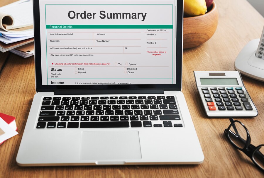
1. Simplify the Checkout Process
Alright, let’s get real—nobody likes paperwork, especially when all they want is to buy that cute hoodie or the must-have kitchen gadget you’re selling. A complicated checkout is like a speed bump in the middle of a racetrack: it kills momentum and drives people away.
I learned this the hard way.
In my early eCommerce days, my checkout process looked like a government application form. Multiple steps, dozens of fields, and confusing buttons that led people in circles. Not surprisingly, most shoppers bailed before hitting “place order.”
Here’s what I did to turn that chaos into conversions:
One Page, If You Can Swing It
I trimmed down my checkout to a single page. No more “Next Step” surprises. Everything—billing, shipping, payment, and review—is now in one tidy space.
If one-page doesn’t work for your platform, clearly label each step with a progress bar or step counter. People hate the unknown.
Remove the Clutter
Do you really need to ask for:
-
Middle name?
-
Company name (for a t-shirt)?
-
“How did you hear about us?” (Save that for after the sale.)
I kept only the essentials: name, address, email, payment info. That’s it. The less effort it takes to buy, the more likely they’ll finish.
Use Smart Defaults
Auto-select the shipping method if there’s only one. Set the billing address to match shipping by default. Pre-fill city and state from the ZIP code.
Little things like this shave off seconds—and trust me, seconds matter.
Give People a Roadmap
If you must use multiple steps, show customers where they are in the process. Something like:
-
Shipping Info
-
Payment Method
-
Review & Place Order
It reassures them. Nobody wants to walk down a hallway with no idea where the exit is.
Keep your checkout short, sweet, and predictable. Make it feel less like a chore and more like a smooth, satisfying final step in their shopping journey.
Because when checkout is easy, buying becomes a no-brainer.
2. Enable Guest Checkout
Okay, here’s the thing: not everyone wants to commit to you on the first date. And by that, I mean—not everyone wants to create an account just to buy something.
Picture this: You’re in a rush to grab a gift or that one perfect pair of shoes, but the site insists you sign up for an account first. Cue the frustration. The last thing you want is to be trapped in a “Sign Up” page when you’re just trying to pay and go.
I’ve been there, and I’ll bet you’ve felt the same. It’s an instant mood killer.
That’s why enabling guest checkout is a game-changer.
Why Does Guest Checkout Matter?
For starters, it reduces friction. Some people like the idea of saving their info for the next time, sure, but most of your customers? They just want to get in and out—and that means no signing up.
It’s a huge turn-off when they’re forced to create an account just to get their hands on what’s in their cart.
Here’s how guest checkout helped me:
-
Fewer abandoned carts. People hate accounts if they don’t need one.
-
Speedy sales. If I make it easy to checkout without needing to register, they’re done in minutes.
-
New customer trust. It lowers the barrier for a first-time buyer.
But… What About Accounts?
Great question. Guest checkout doesn’t mean you should ditch accounts entirely. You just don’t want to force people into creating one upfront.
After the sale, you can offer perks for registering, like:
-
Saving their order history
-
Faster checkout for next time
-
Exclusive discounts or rewards
I also make sure they know the perks before checkout ends, like “Create an account later to track your order and get 10% off your next purchase.”
A Few Stats to Back It Up:
I’m not just saying this based on gut feeling—guest checkout is known to increase conversion rates. Research shows that when forced to create an account, shoppers are more likely to abandon their carts.
And guess what? Almost 40% of customers will just give up entirely if they can’t checkout as a guest.
No one wants to sign up before buying. Let them check out as a guest and give them a reason to create an account after the fact. It keeps the process quick, painless, and—most importantly—more likely to convert.
So, stop asking people to “join the club” before they’ve even bought a membership.
3. Be Upfront About Costs
There’s nothing quite like getting hit with surprise fees right before you click “Place Order.” It’s like ordering pizza for $10 and seeing it jump to $17 at checkout.
Trust me, if you’re hiding shipping fees, taxes, or other extras, people will leave. Fast.
So what should you do?
-
Display total costs early, ideally on the product page.
-
Use a shipping calculator based on ZIP/postal code.
-
Offer free shipping if possible—or make it clear how to qualify.
Transparency isn’t just nice. It’s profitable.
4. Show Trust Signals and Security Icons
Let’s be honest: the internet is still the Wild West in some corners.
If someone’s never heard of your store before, handing over their credit card info can feel… risky.
That’s why trust signals are everything.
Here’s what I use on my checkout page:
-
SSL certificate badge (that little padlock means a lot).
-
Payment icons (Visa, MasterCard, PayPal, etc.).
-
Testimonials and star ratings near the cart area.
-
Secure checkout messaging like: “100% Secure & Encrypted”
People want to feel safe. Show them you’re legit.
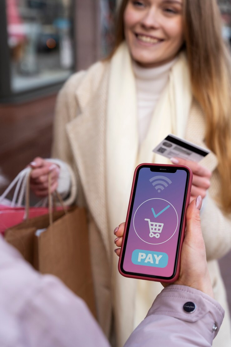
5. Offer a Variety of Payment Methods
Look, everyone has a different favorite way to pay. Some folks love PayPal. Others swear by Apple Pay. A few adventurous souls might even use Klarna or Afterpay.
If you’re only offering one or two options, you’re leaving money on the table.
My rule of thumb?
-
Credit/debit cards
-
PayPal
-
Digital wallets (Apple Pay, Google Pay)
-
Buy Now, Pay Later (Klarna, Affirm)
-
And if you sell internationally: local options too
The more flexible you are, the easier it is for people to say “yes.”

6. Make Checkout Mobile-Friendly
Quick stat for you: more than 60% of online shopping happens on mobile devices. And if your mobile checkout feels like trying to type on a microwave, you’ve got a problem.
A mobile-friendly checkout means:
-
Large, tappable buttons
-
Minimal scrolling
-
Auto-fill enabled
-
Input fields that match the keyboard (e.g., number pad for phone numbers)
Always, always test your checkout flow on a phone. Actually, test it on three. If your thumbs are cramping or you’re cursing under your breath, your customers are too.
7. Use Autofill and Address Validation
Let’s talk about laziness. Not in a bad way—just… human nature.
Typing out full names, addresses, and zip codes? It’s tedious. Especially on a small screen.
Here’s how I make it easier for my customers:
-
Enable browser autofill
-
Integrate address validation (think Google Maps style autocomplete)
-
Use country-specific field formats
Not only does this make things faster—it reduces shipping errors and returns. Win-win.
8. Use Exit-Intent Popups and Cart Recovery Emails
You can’t catch everyone before they leave, but you can certainly try.
I’ve had surprising success with exit-intent popups—those little “Wait! Don’t leave!” messages that appear when someone moves their cursor toward the top of the screen.
What works well:
-
Offering a small discount (“Take 10% off if you complete your order now!”)
-
Adding urgency (“Only 3 left in stock!”)
-
Showing FAQs (“Still got questions?”)
And if they still leave? No worries. Send a cart recovery email within 30–60 minutes. Keep it short, friendly, and maybe add a cheeky GIF. Humor helps.
9. Provide Clear Return and Refund Info
People aren’t just buying products—they’re buying peace of mind.
If someone’s unsure about your return policy, that hesitation can stop a purchase cold.
So here’s what I do:
-
Link to my return policy directly from the checkout page.
-
Use plain English, not legal gobbledygook.
-
Highlight flexible returns and refund timeframes.
You’d be amazed how many people go through checkout just to check the return policy. Make sure it gives them a warm, fuzzy feeling.
10. Test, Measure, and Tweak Like a Mad Scientist
No two stores are the same, so there’s no perfect formula.
That’s why I’m constantly A/B testing. Sometimes even silly little changes lead to big gains.
Things I’ve tested (and seen results from):
-
Changing button text from “Continue” to “Complete My Order”
-
Moving the discount code field to the end
-
Making the CTA button a brighter color
-
Reducing checkout steps from four to two
Use tools like Google Optimize, Hotjar, or even simple Shopify apps to experiment. Just change one thing at a time so you can track what’s working.
Bonus Tip: Add Live Chat or Help Widgets
Sometimes shoppers just have a quick question: “Will this arrive by Friday?” or “Can I use two discount codes?”
Having live chat support or even an FAQ widget at checkout can prevent them from abandoning the cart just to look for answers.
I use a chatbot that covers common questions and escalates to me if needed. Saves sales all the time.

Conclusion
Wrapping It Up: Make It Smooth, and They’ll Glide Right Through
If there’s one takeaway here, it’s this: checkout should feel effortless.
You’ve done the hard part—attracting, convincing, converting. Don’t lose the sale at the finish line because of clunky design, hidden fees, or an overly eager account signup.
Test. Simplify. Be transparent. And treat your checkout like the VIP lounge of your store.
The smoother the journey, the more people will complete it.
(Maybe you are also interested: Email Marketing Strategy for New eCommerce Websites)
FAQs
1. Why is the checkout process so important for my eCommerce store?
The checkout process is the final step before a sale is completed, and it’s often where many potential customers drop off. If your checkout is complicated, slow, or unclear, you’re going to see cart abandonment rates skyrocket. A smooth, easy-to-follow checkout boosts your chances of closing the deal, ensuring customers have a positive experience from start to finish.
2. How do I reduce cart abandonment on my site?
To reduce cart abandonment, focus on simplifying the checkout process. Offer guest checkout, be upfront about all costs (shipping, taxes), and display trust signals like secure payment options. You can also use exit-intent popups to capture customers leaving and send cart recovery emails. Essentially, make the checkout as fast and frictionless as possible.
3. What payment methods should I offer in my eCommerce store?
The more payment options you offer, the better. Make sure to include credit and debit cards, PayPal, Apple Pay, Google Pay, and, if possible, Buy Now, Pay Later services like Klarna. Additionally, consider offering regional or local payment methods if you sell internationally. The more flexible you are with payment options, the easier it will be for customers to complete their purchases.
4. How do I make my checkout mobile-friendly?
Since so many people shop on their phones, optimizing your checkout for mobile is a must. Keep it simple: make buttons large enough to tap, minimize typing (with features like autofill and address validation), and ensure the entire page loads quickly. Test your checkout flow on different devices to ensure it’s easy to use on both smartphones and tablets.
5. Is guest checkout really necessary?
Yes! Forcing users to create an account before completing their purchase can increase friction and lead to cart abandonment. While you can offer account creation after the sale, guest checkout allows for a quicker, hassle-free experience. It encourages more people to complete their purchases, especially first-time visitors who might not be ready to commit yet.
6. How often should I test my checkout process?
Testing should be a continuous process. You don’t need to overhaul everything every month, but make it a habit to A/B test small changes (like button colors, text, or the number of checkout steps) regularly. Even minor tweaks can have a big impact on your conversion rates, and consistent testing helps you identify new opportunities to optimize your checkout flow.